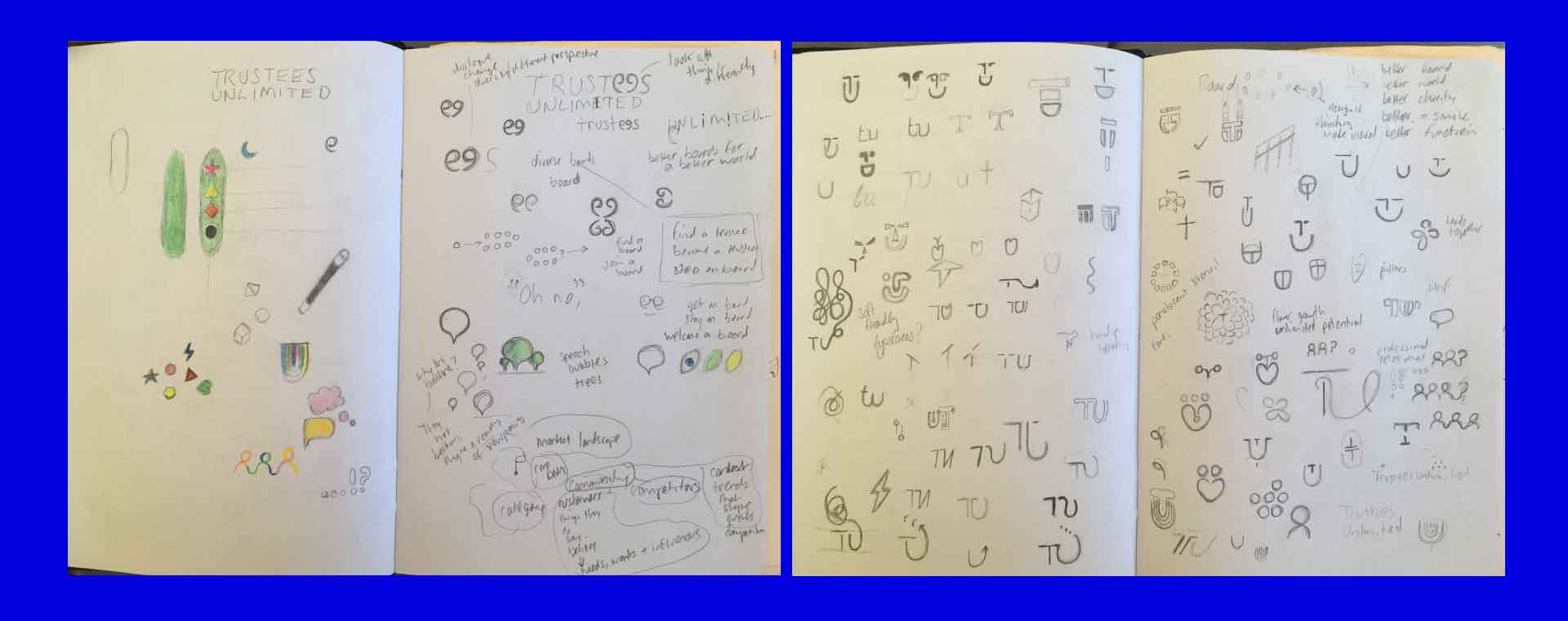
Trustees Unlimited
A business with a social purpose: to help trustees and boards develop, diversify and thrive, creating a wider societal flourishing. To do this effectively however, would require a brand and website that was fit for purpose.
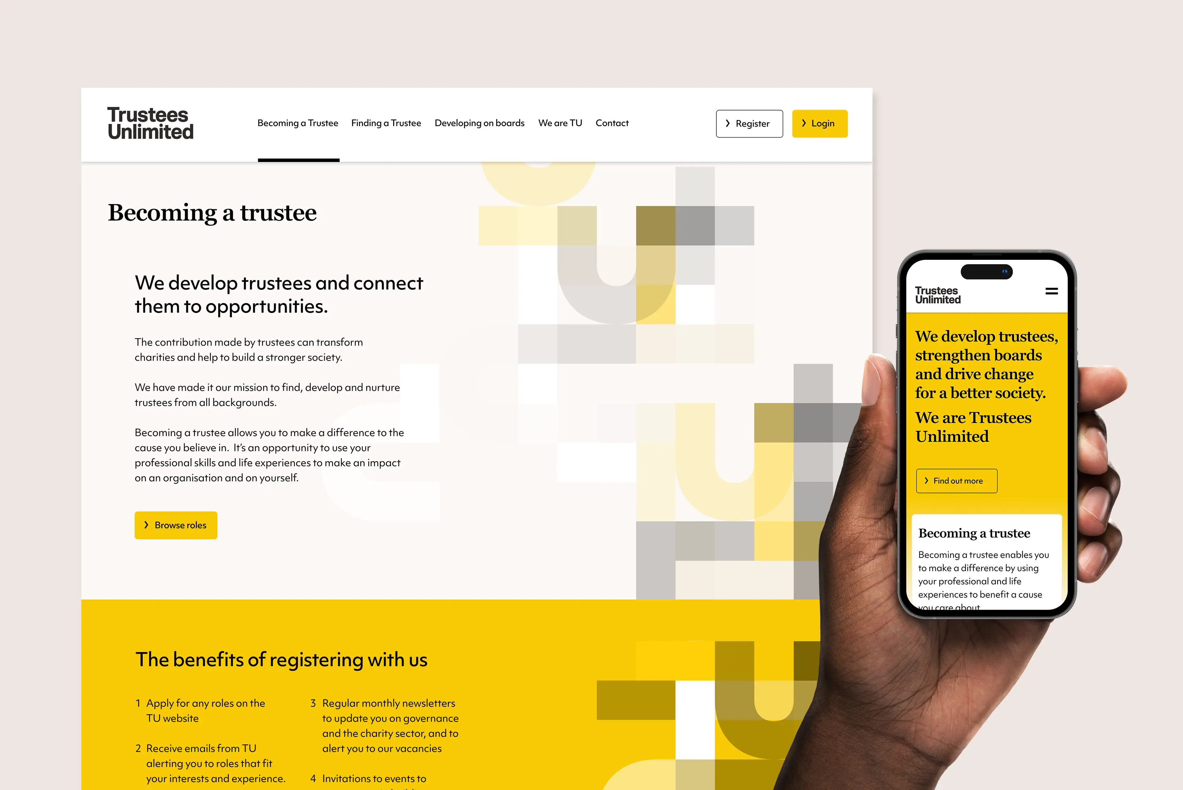
The project and business vision was close to my heart: help people and make a difference to society. This visual shows the homepage of their site, a very clear and 'no nonsense' approach; the pattern nods to 'T' & 'U' and the differences in people; the way they see things and the way we weave together relationally to make something beautiful.
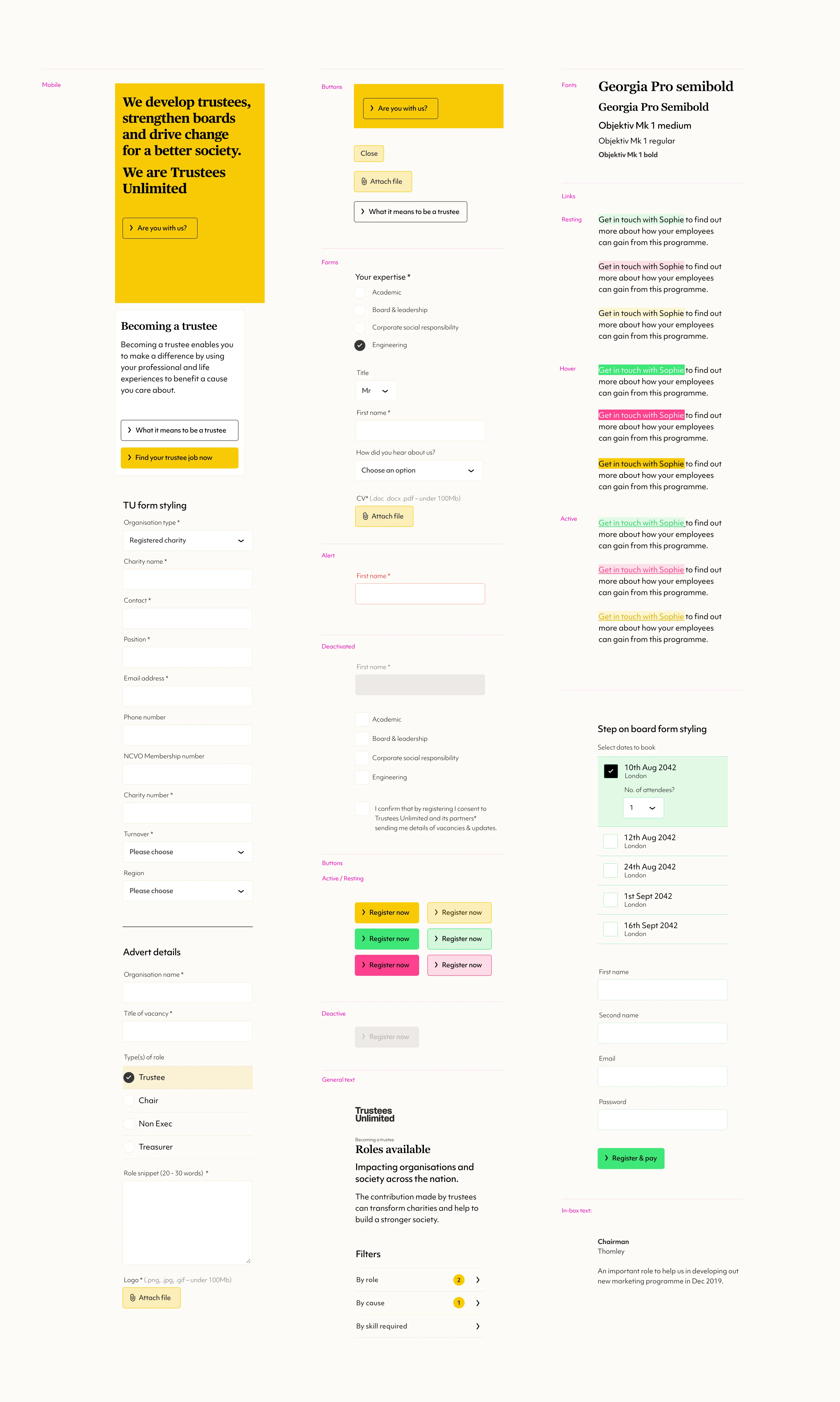
Examples of mobile user interface items from the Trustees Unlimited design style guide. I also produced brand style guidelines for this project too.
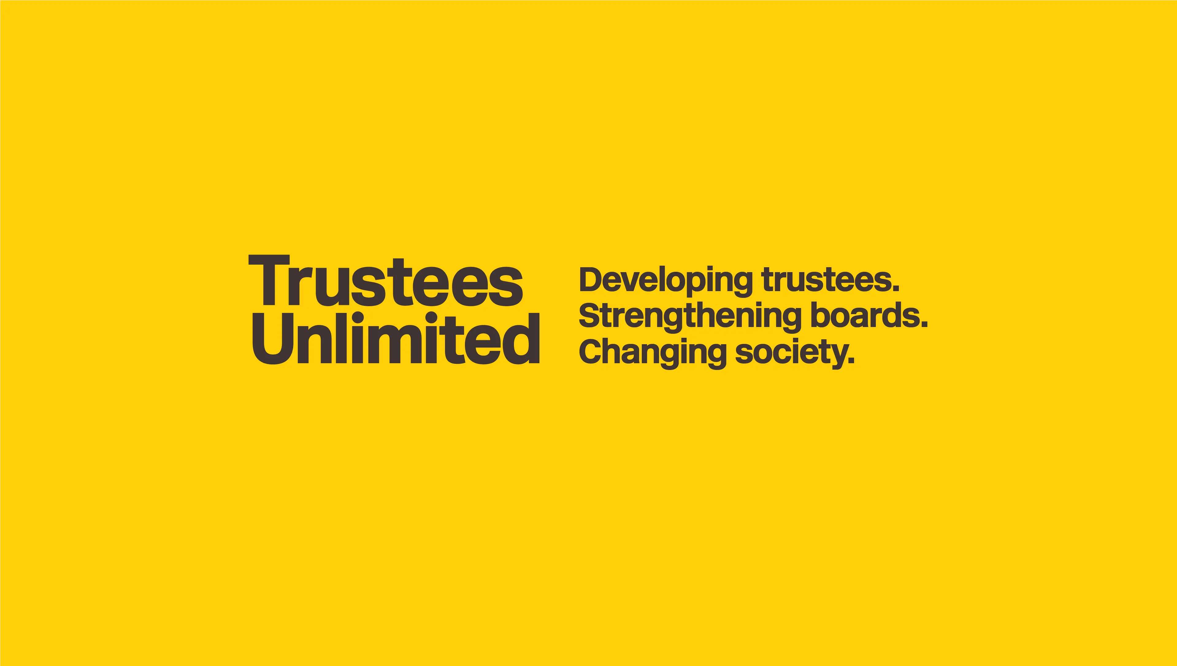
Shown here are the straplines I developed for the business that neatly summerise their activities, beliefs and raison d'etre.*
* I must give credit to Anna Corbett for helping with some of the final wording.
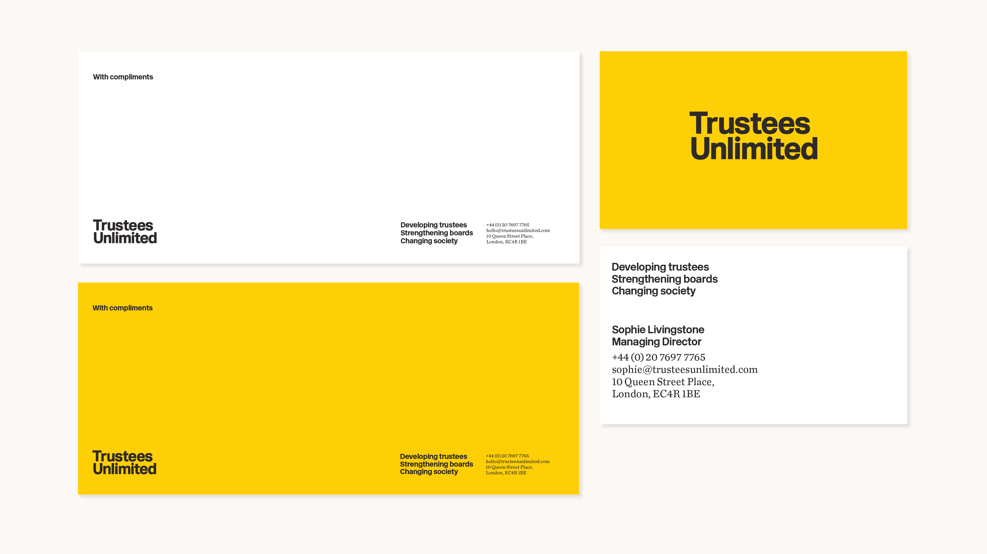
Trustees Unlimited - Compliment slip designs and their business card design.
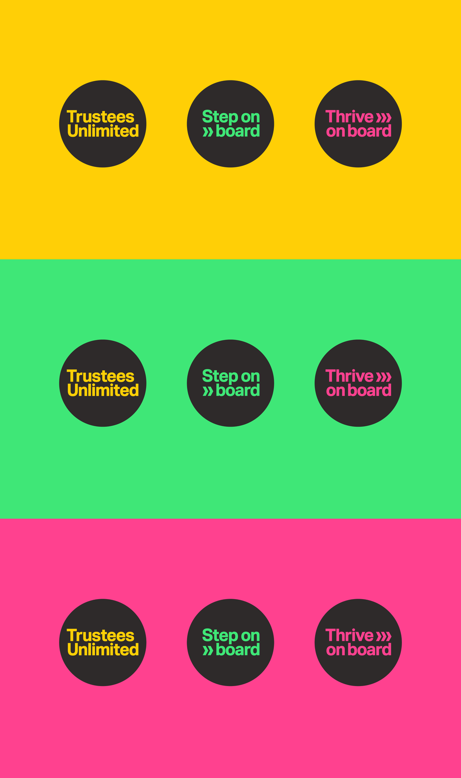
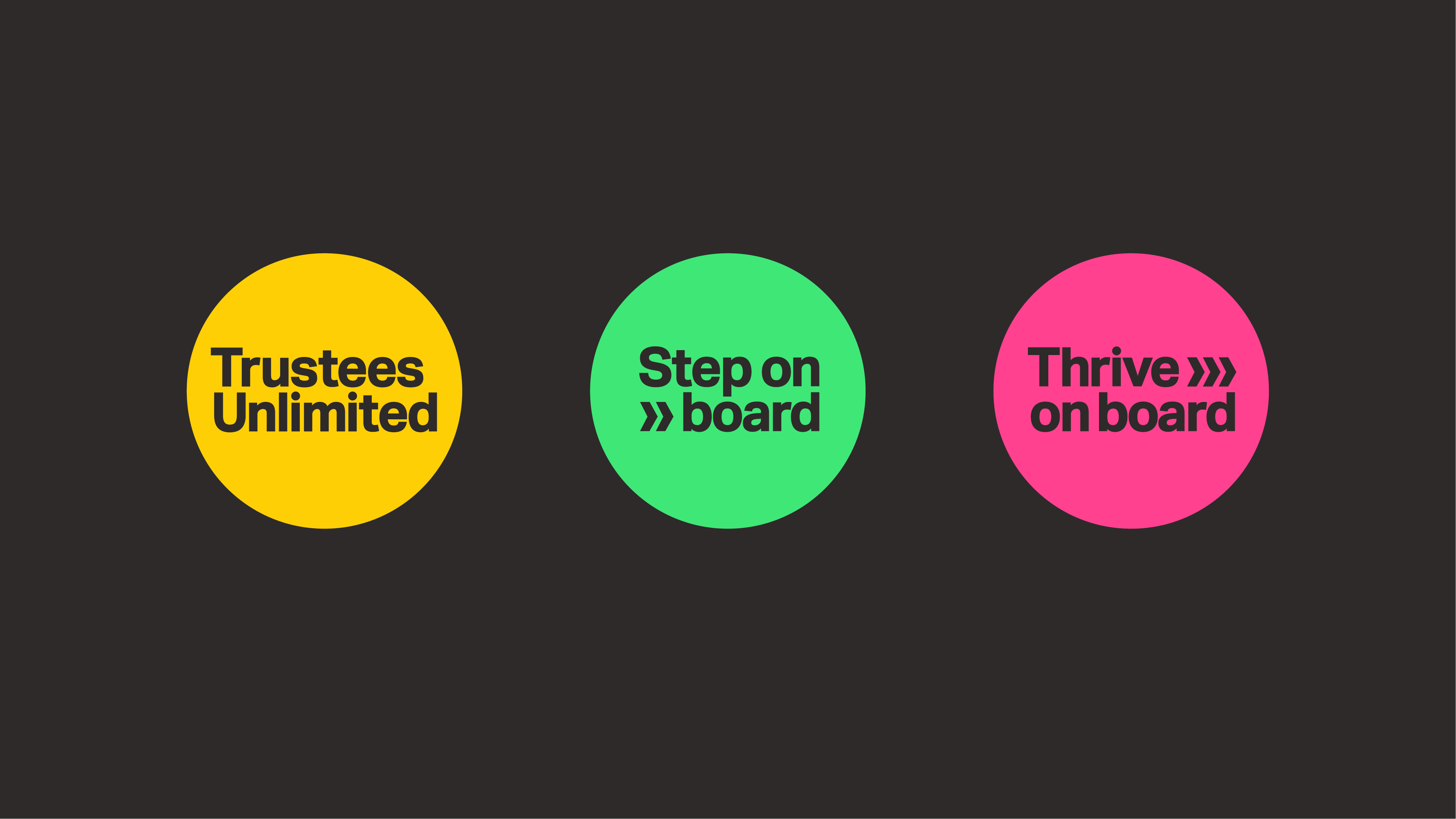
Trustees Unlimited runs programmes for helping trustess: one helps secure positions on boards, the other supports a trustee once they have secured a board position. Both of these programmes needed sub-brands.
A selection of rejected logos

My favourite of the many rejected logos for this project, I loved this logo and felt it worked really well - C'est la vie. The show must go on and the client must be happy!
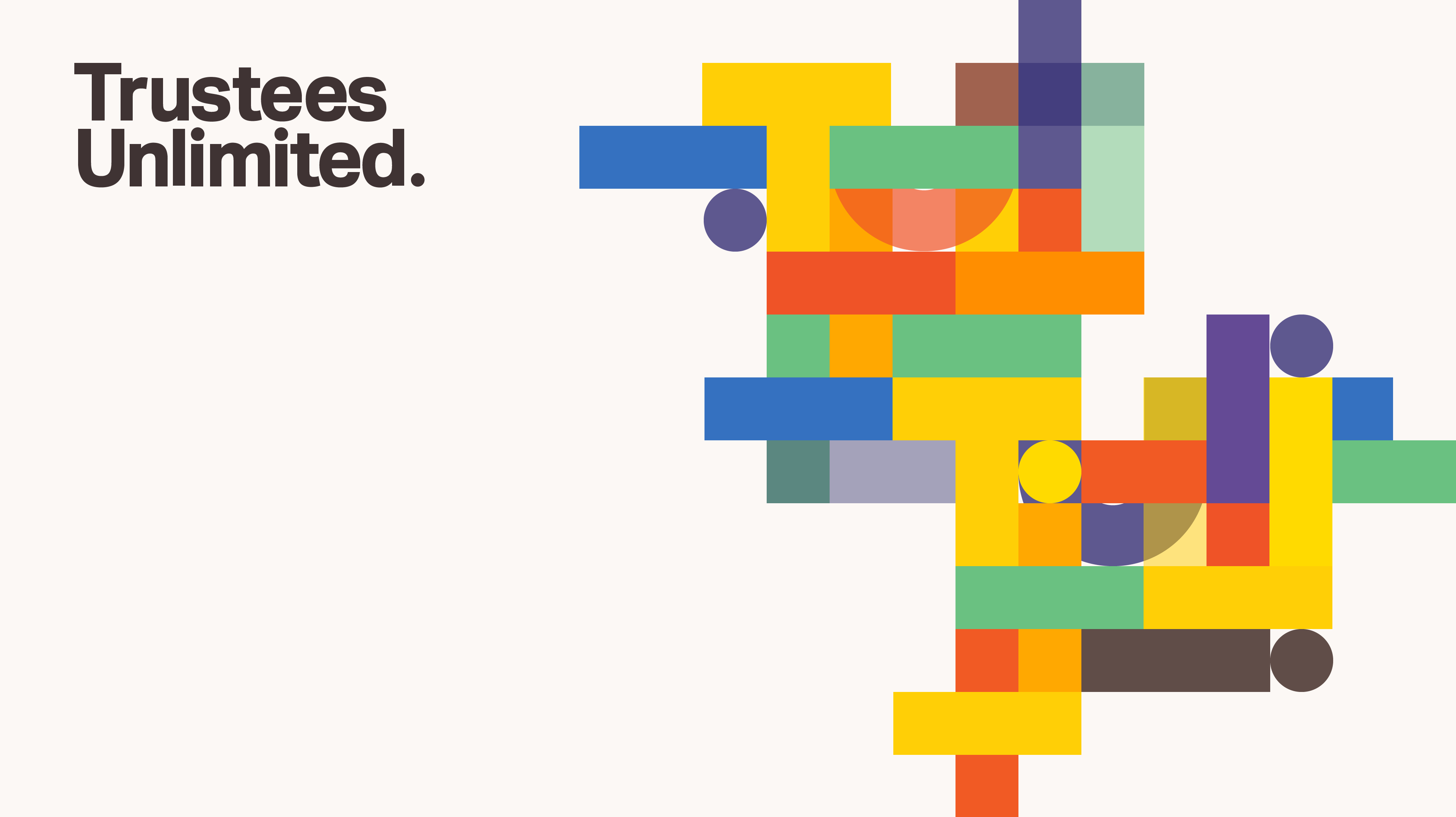
The client rejected this colourful brand concept. I thought it worked well, square pegs in round holes, vibrancy of opinion, overlay and shaping communicating differing experience and backgrounds, coming together in colour to form a beautiful and organised picture. You can see the client retained the pattern

Another rejected pattern concept, I know that showing this is overkill but I just love these colours, rich, deep and layered, great for comunicating interwoven thought and perspective.
